Your Cart is Empty
FREE U.S. DOMESTIC SHIPPING
FREE U.S. DOMESTIC SHIPPING

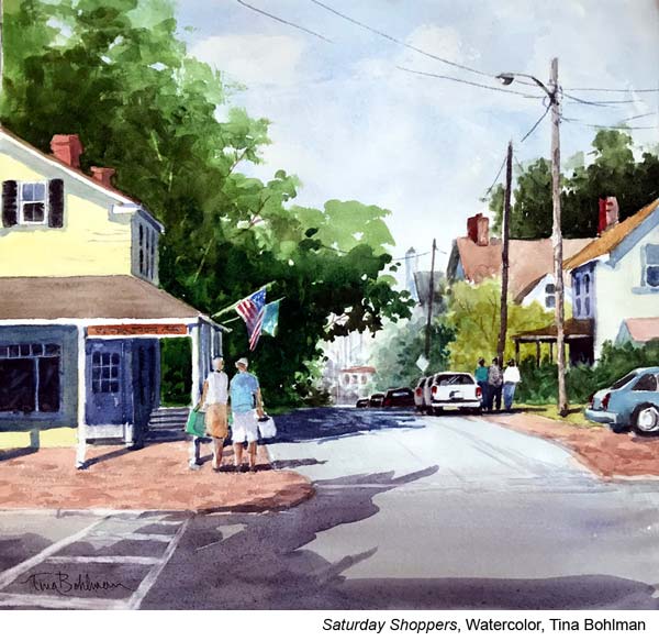
A Texas native, Tina Bohlman has used the state in which she was raised as both the inspiration and the canvas for her art. A self-taught artist, Bohlman is well versed in several mediums but favors watercolor and oil to create breath taking plein air paintings and brilliant rural landscapes.
What does plein air painting give you as an artist? Why do you recommend it to artists?
I recommend plein air to artists because painting on location gives me information that a photograph cannot, including but not limited to: subtle value shifts within the shadows; the temperature and atmospheric conditions that affect the light; “true” local color; an emotional connection to the subject matter; and a 360 degree view.

Could you walk us through your process? What do you need to have figured out at each stage?
At the onset, the subject matter has to interest me. Then I make a quick determination whether the elements (shapes), light & shadow patterns have the potential to create a good design and composition.

Where does planning come into your process? What does that planning look like? (Thumbnails, color studies, sketchbook work etc.)
After I’ve decided to explore the scene more in depth, I spend 5 or 10 minutes making a couple of small, 3” or 4” thumbnail pencil drawings. I place my center of interest first, then separate the ground planes (foreground, mid-ground, background) using 3 values. I compose within a vertical, horizontal, or square format (the subject matter usually dictates the best format). Once I have the design elements, value pattern and format figured out, I unpack, set up and clip the sketch to my easel for reference.

To someone just starting out, do you recommend starting to paint from life or starting from a reference photo? Why?
There’s a learning curve at the beginning that’s pretty steep and it is a totally different experience from the controlled environment of a studio. So I don’t recommend artists trying to paint outdoors until they first spend some time in the field with a sketchbook, pencil and small watercolor kit.
Study the subject and how the light falls on it. Make color & value “notes”. Pay close attention which direction the sun is traveling and how quickly the shadows can change not only in shape but in value and temperature…sometimes even reversing direction! Learn to capture shadow patterns quickly.
There are so many distractions so it’s important to stay focused.

When painting en plein air, how do you decide whether or not to paint a specific scene? What makes a good plein air painting scene? (What makes a bad plein air painting scene?
There are 3 deciding factors for me on whether to paint a scene:
1st is the light; I’m drawn to dramatic shadow patterns,
2nd is the subject; I favor architecture in the landscape, and
3rd is the local color; I look for a strong color accent.
An artist has the license to rearrange the scene so, having said that, there really aren’t any “bad” plein air painting scenes; a spectacular scene for one artist is a so-so to another. It depends on whether the artist can relate to the scene.

There can be a lot to take in when working on location. How do you begin to simplify the scene?
Other than ignoring distractions and staying focused, simplifying is probably the most difficult thing to do. It takes practice…and a good sense of design.
To simplify a scene, first squint so that you’re not seeing details, but just large dominant shapes with lights & darks. Next, make a quick thumbnail sketch with just those large shapes and values and use that as your guide. The hard part is to stay true to that simplified sketch.

You’ve mentioned massing being important? Could you explain what massing is and why it matters?
Massing goes hand in hand with simplifying. Squint to make that area in the tree a large mass of variegated greens instead of thousands of individual leaves. The side of a barn can be a mass of variegated grays instead of individual boards. After you’ve painted the mass, you can go back in with a few well-placed accents to help define it.

When you’re on site, what do you need to know about color? How do you capture that information so that you can refer to it later?
The color wheel is a handy reference source and a time-saver especially when looking for the complement to a color. Remember also that color temperature depends on the time of day. Morning light is cooler so colors will be cool, leaning toward blue. Afternoon light is warmer so colors are warm, leaning toward red.
If I don’t have the 2 or 3 hours to complete the painting on location, I’ll gather enough information for a studio painting. I carry a travel kit that has a small watercolor palette, water jar, brush, pencil & sketchbook. I make color swatches with notations & take reference photos with my phone.

What makes a strong painting from a design and composition standpoint?
There are several things that factor into making a strong painting, but I think the most important is the value pattern. Strategic placement of light, medium and dark values is key to the strength of the design and composition regardless of the subject matter.

What are the biggest struggles you see beginning watercolorists facing? What advice do you give them?
Beginning watercolorists have difficulty with “reading the puddle” in their palette. Watercolor dries about 3 times lighter in value. In my beginning classes, we spend a lot of time mixing paint and learning that the viscosity of the mixture (is it watery, creamy, or sticky?) determines the light, medium, or dark value of that “wet” stroke when it’s dry.
An overworked painting happens when the mixture in the palette is misread and multiple strokes are applied attempting to get a darker value. Overworking reduces the spontaneity and transparency in a watercolor.
My advice is to be patient and take the time to explore the unique characteristics of watercolor. Embrace the fact that you’re never completely in control. Be observant and allow the paint to take its own path. Unlike any other medium, the element of surprise is always present in the process often resulting in a pleasant outcome.
Learn more about Tina Bohlman at her websiteand on Facebookand Instagram.
